Digital Art

Atami
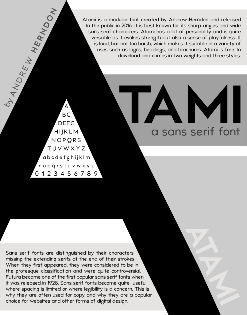
I was tasked with creating a grayscale 11″ x 14″ poster which contained the following details:
- The name of the classification and of a font
- The description of the type classification
- A description of the font and the font designer
- A full alphabet of the font including upper and lower case
- Numbers 0-9 of the font
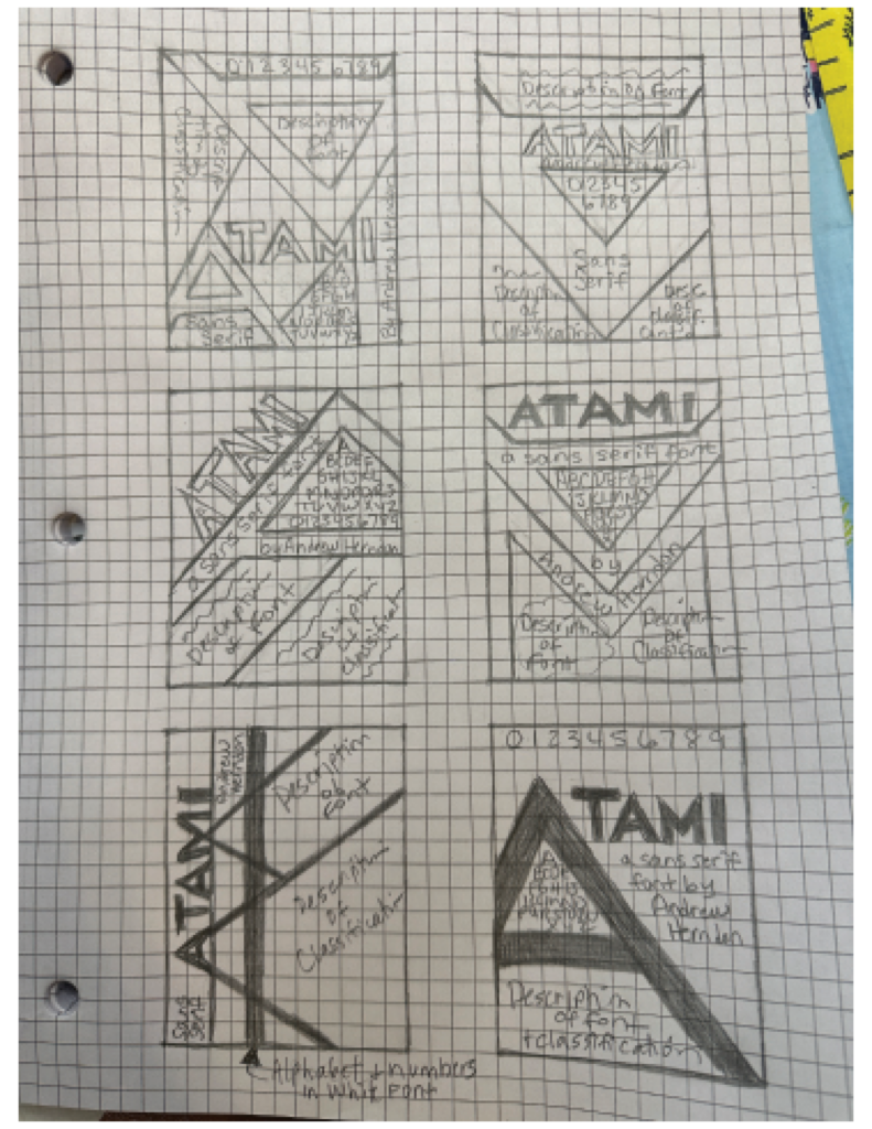
This is what’s known as a Type Classification Poster and I created it using Adobe InDesign. I decided to use the Atami font because I was drawn to its bold, sharp angles and versatility. Below are the hand sketches I made for this project. As you can see, my final design was mostly based off the last sketch on the bottom-right:

0
Tags :